Your website’s home page is the front door of your company. It’s the first impression your customers get and it’s where they choose whether or not they’ll stay a while. Unfortunately, all too often we come across home pages that just don’t serve their purpose. A website’s home page can be quite difficult to formulate, but if you’ve got these 10 things, you’re on the right track!
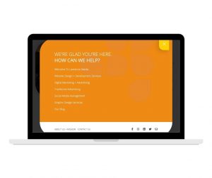
Your site menu serves as the main navigation tool for customers visiting your website. With a clear path throughout your website, the bounce rate (percentage of users leaving the site rather than continuing to other pages) will decrease. Your site menu should be easy to find and use, and it should highlight important pages.
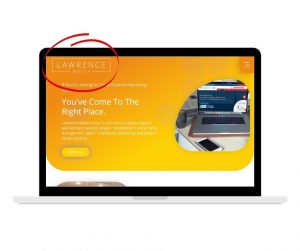
Your logo should be the first thing users see when visiting your website. Logos are usually placed in the top, left hand corner, but can also be placed in the top-center or top right hand corner. It’s important that your logo stands alone, so it stands out and users can see it clearly. On-top of constantly reminding users whose site they’re on, your logo also provides a great way to easily navigate back to the home page when on another page of the site.
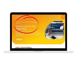
What does your site have to offer? This should be specified in a headline towards the top of the page, where visitors can easily decipher whether they’ve come to the right place. The headline should be seen within a few seconds so the customer won’t leave your site. Always keep your headline simple, short, and clear.

The sub-headline let’s users know what’s in it for them. This element should describe what you have to offer. You’ll want to keep this short and to the point as well. Users will only take a few seconds to read this, and you want them to read it all.
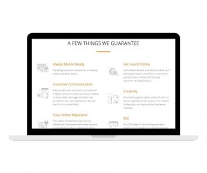
Further down the page it’s important to describe why what you do matters. This is the first step in your sales process, and it’s right on the homepage. If you make a good impression describing how you can help them, they’ll be more willing to buy your product or use your service.
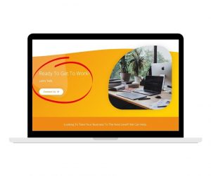
To compel users to dig deeper into your site, provide calls to action. While the homepage is very important, it’s not the only page we want them to see. To easily propel your users to where you want them to go, call to action buttons, links, etc. are a great tool.
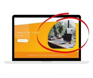
Nobody is going to stay on your website if it’s boring. Visual imagery catches the attention of your users and gives them something to connect with. Without visuals on your homepage, users will get bored and leave immediately. Make sure images clearly support your brand and entice users to stay on your site.
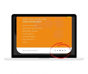
If you’re not including links to your social media pages on the homepage of your website, you’re selling yourself short. Many users see social media as a sort of brand reputation. If they can’t get to your social media accounts quickly and easily, they could get frustrated and become distrustful.
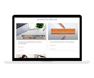
Your website should be a resource to learn more about who you are and what you do. To show that you’re knowledgeable and experienced in your field, provide resources that give users a platform for learning. It’s important to know that while they may not be ready to buy, they’re definitely interested and you need to be in front of them when they’re ready to pull the trigger.
Provide customer success stories, reviews, awards, recognitions, and other indicators of success received by your brand. This helps users gain a positive first impression of you. After all, 93% of consumers read reviews online before buying.
For help building your website’s home page, contact Lawrence Media Group. We are a full service creative agency specializing in website design and development, digital and traditional advertising, and graphic design services.
